Spark: Visualizing Physical Activity Using Abstract Ambient Art
Ian Li
May 1, 2012
 Chloe Fan has been self-tracking since she was 14 years old and saw the first Harry Potter movie in theaters. She is currently a Ph.D. student at Carnegie Mellon’s Human Computer Interaction Institute. After finding her passion for data visualization and information design for self-tracking tools, she has decided to take a year off grad school to pursue her dreams at full speed in the Bay Area. She is available for consulting or full time positions!
There is a huge increase in the number of personal informatics tools over the last few years that help us track various aspects of our daily lives. The majority of consumer tools use visualizations, often in the form of charts (i.e., column graphs, line graphs, scatterplots), to help users understand the numerical data that they are collecting, and find meaning in their behavioral patterns. Research tools have also used nature metaphors, like a garden or a fish tank, that thrives on physically active users. While promising in motivating behavior change, they can also be punishing when users are inactive (sad fish or wilting flowers).
 |
 |
I am specifically interested in exploring abstract art as visualization for physical activity. It’s able to present information in an aesthetic and neutral way that is non-judgmental. Reflecting on abstract artwork by Wassily Kandinsky, Piet Mondrian, and Jackson Pollock, I created Spark, a system that uses abstract art in a dynamic ambient display for physical activity.
System Description
Spark is a web application hosted on Google App Engine. The backend is coded in Python, and the frontend coded in HTML, CSS, and JavaScript. It can be viewed on a computer, or more ideally, displayed on a surface in the home (e.g., a tablet computer mounted on the wall, or projected directly onto a wall). The data visualizations are created with Raphaël, a JavaScript vector graphics library, and HTML5 Canvas. Spark uses OAuth and the Fitbit API to continuously pull step count data from the Fitbit tracker and display them using one of 4 current abstract visualizations.
Each visualization is an animation that unfolds as the day progresses. Circles are created based on step counts. The size of the circle represents number of steps, and the color of the circle represents intensity (casual walking, brisk walking, or running).
Spiral
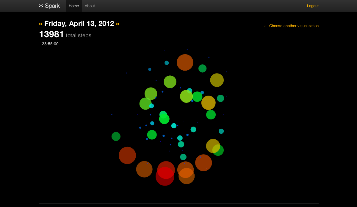
Every five minutes, a circle appears in the middle of Spiral that represents the steps taken during that five-minute period. It pushes previous circles outward in a spiral, so steps taken earlier that day appear at the edge. If no steps are taken in that five-minute period, no circles appear.
Flora
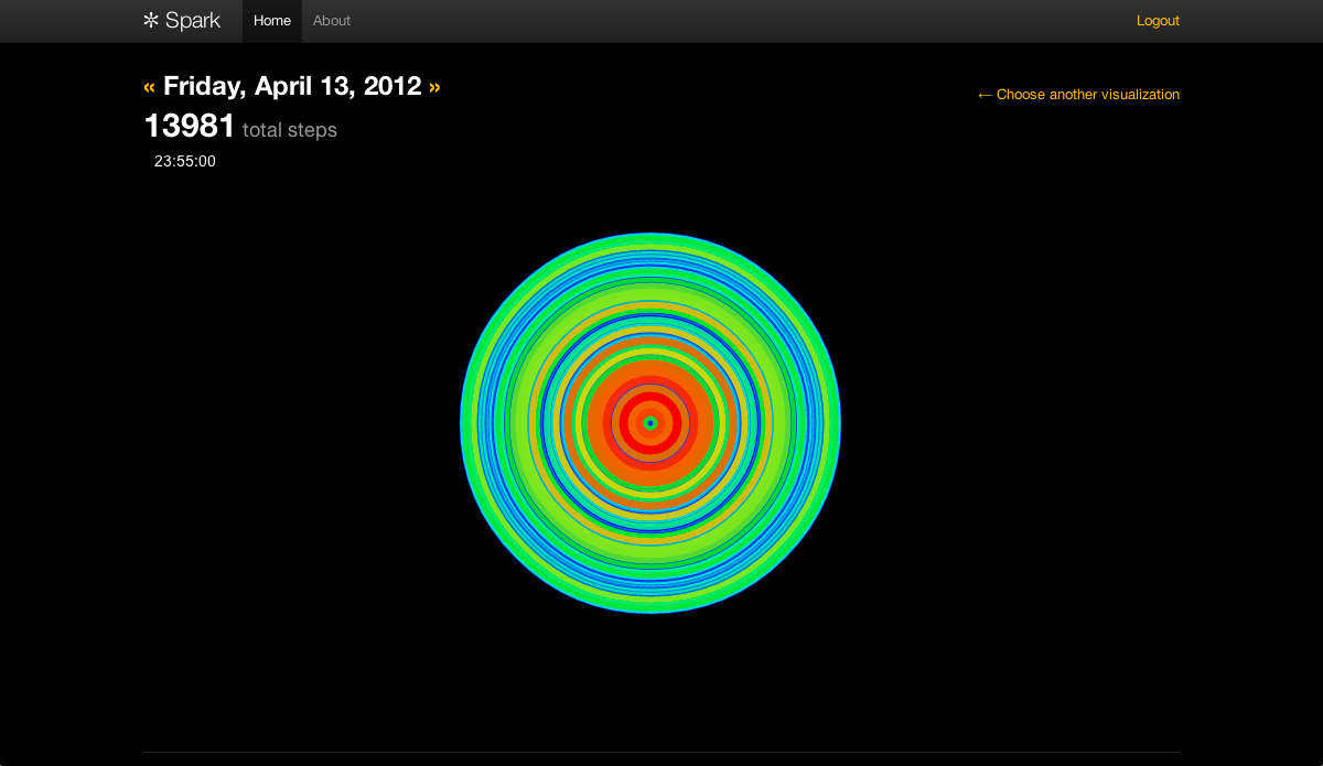
In Flora, rings of color are added around a circle for every five-minute period with step counts. The result is a series of concentric circles showing periods of activity throughout the day, with the final size indicating the total step count for the day.
Bucket
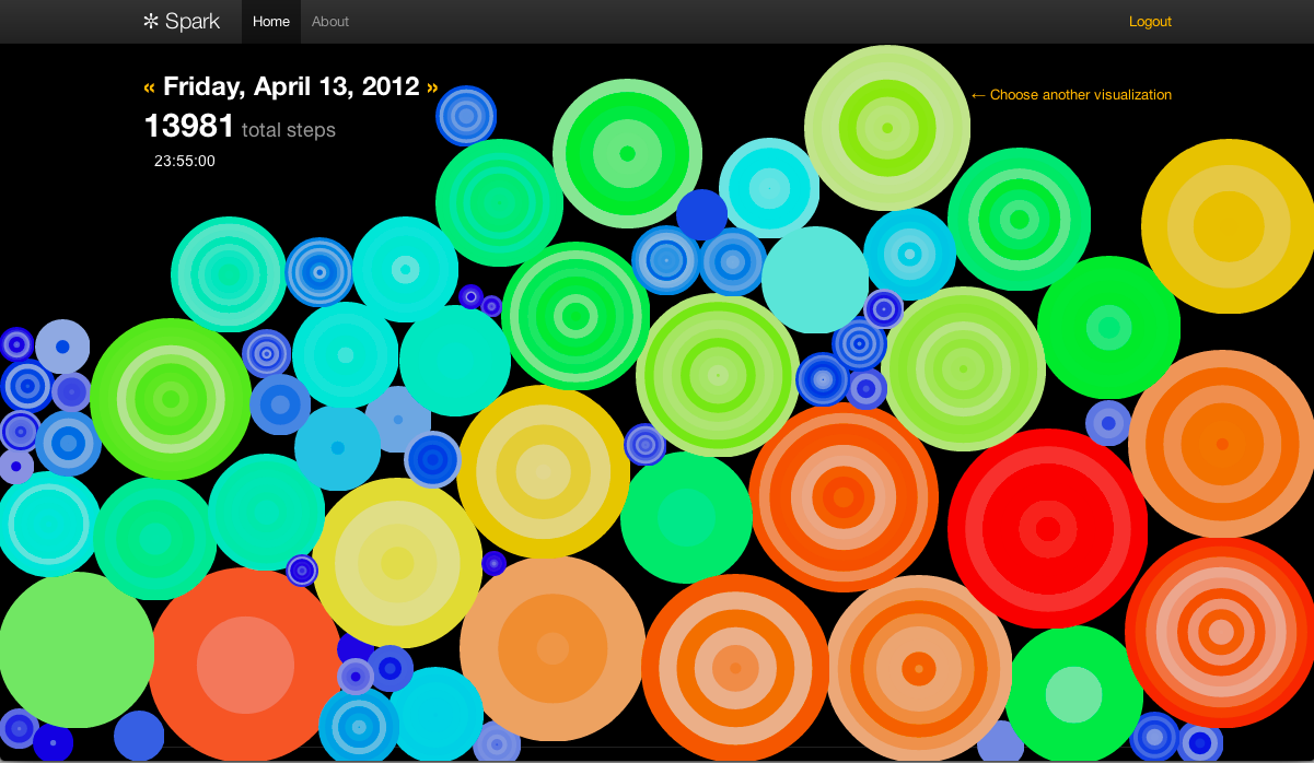
In Bucket, colorful circles fall from the top and fill up the screen to represent steps taken every five-minutes. We found that the use of concentric circles made the visualization more aesthetically pleasing; however, the concentric circles do not yet represent anything meaningful.
Pollock
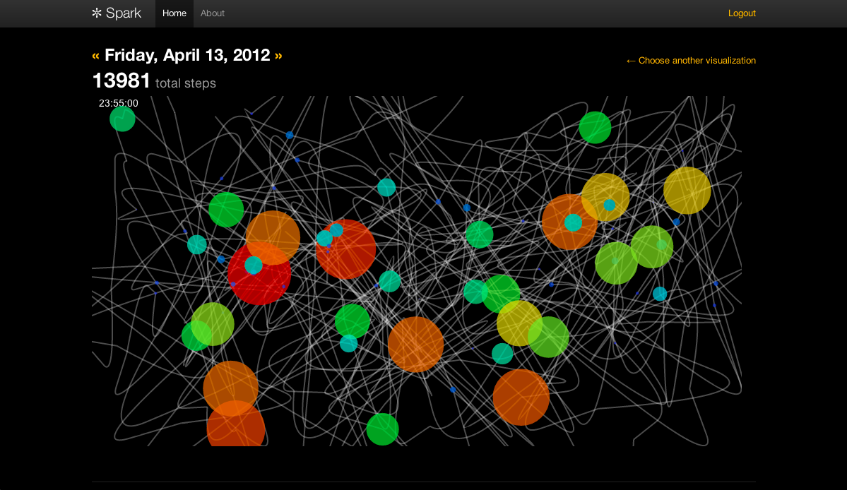
Inspired by Jackson Pollock, Pollock is the most random of these abstract visualizations. A white line draws randomly across the screen, and when there is activity, the canvas is splattered with color.
Study
I conducted a study with Spark deployed on tablets in 5 homes over 3 weeks, just to see how people interacted with this kind of display. Everyone reacted positively to it, but the most interesting finding was that the 3 younger adults (20+ females) preferred Spiral and Rings because they were looking for specific time and intensity data regarding their gym sessions. The 3 older adults (58-71 years old) preferred Bucket and Pollock because they were interested in daily cumulative totals from walking a lot.
Some of the things people said motivated them to do more activity short-term were the colors, variety of visualizations, and the visual challenge of filling up the screen with colors. I also got lots of good feedback on displaying the data differently, like as a screensaver or hung on a wall like a piece of artwork.
Future Work
There are many planned features for Spark, including:
- Weekly and monthly view showing the final visualization for each day
- Aggregate daily/weekly/monthly statistics
- Adding more charts to compare with the abstract visualizations
- Inclusion of other physical activity properties, such as speed, location, indoor/outdoor activity, and type of activity (i.e., biking vs. swimming). Currently, the Fitbit tracker does not distinguish between activities, so this feature will need data streams from other sensors.
Spark is still in early stages, but if you’d like to check it out with your own Fitbit data, you can sign up at www.sparkvis.com/fitbit/auth. It will connect to your Google account (username data only) to identify you on the Spark site, and you will also need to log in to your Fitbit account to get your Fitbit data (it’s a hassle, but the easiest way I can get it to run right now). Would love to hear your thoughts on improving Spark!


