2015 QS Visualization Gallery: Round 4
Ernesto Ramirez
August 13, 2015
We’re excited to share another round of personal data visualizations from our QS community. Below you’ll find another five visualizations of different types of personal data. Make sure to check out Part 1, Part 2, and Part 3 as well!
 Name: Damien Catani
Description: This is an overview of how I have been doing today against my daily habit targets. Yes, I had a good sleep!
Tools: I used a website I’ve been building for the purpose of setting and tracking all goals in life: goalmap.com
 Name: Bethany Soule
Description: This is my pomodoro graph. I average four 45 minute pomodoros per day on my work, and I track them here. This is where most of my productivity occurs! There’s some give and take.
Tools: The graph is generated by Beeminder. I use a script I wrote to time my pomodoros and submit them to Beeminder when I complete them. The script also announces them in our developer chat room, so there’s also some public accountability there as well.
 Name: Steven Zhang
Description: This plot shows the time I first go to sleep, against quality of day (a subjective metric I plot at the end of every day). What this tells me is that if I get a full night’s sleep of 8 hours, for every hour I got to bed, I can expect a .16 decrease in my QoD rating, which, given my range of QoD around 2 to 4, is about a 5% decrease in quality of day.
Tools: Sleep as Android to track sleep and some python scripts for ETL.
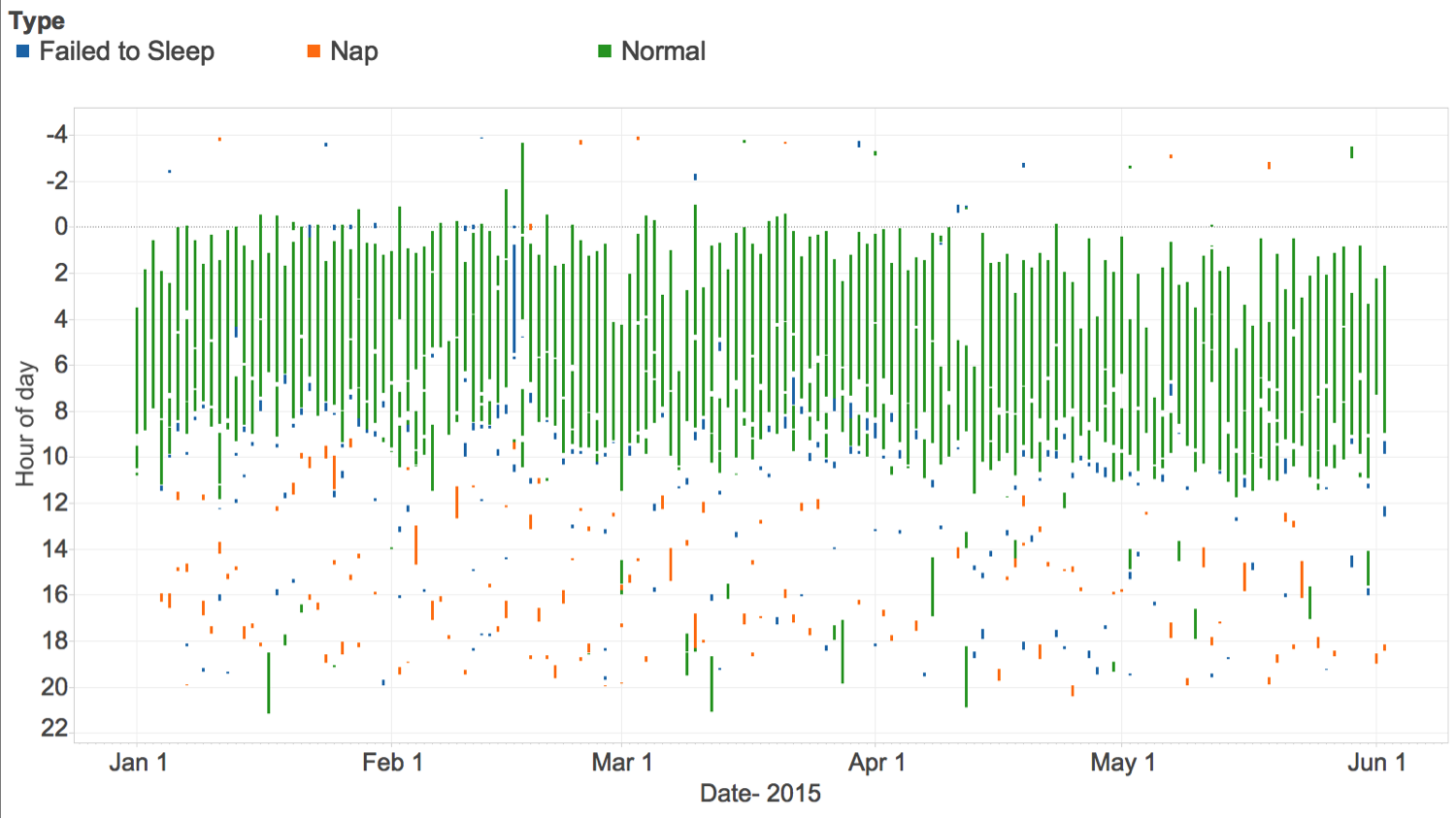 Name:Steven Zhang
Description: Log of all my sleep for the last 6 months, labeled by the types of sleep I most often encounter
- Normal sleep
- Napping
- 3. Trying to achieve normal sleep, but failing to
Tools: Tableau for visualization. Sleep as Android for logging sleep.

Name: Eric Jain
Description: Benford’s Law states that the most significant digits of numbers tend to follow a specific distribution, with “1” being the most common digit, followed by “2” etc. But my daily step counts show a slightly different distribution: The fall-off from “1” to “2” is larger than expected, and the frequency of digits larger than “5” increases rather than decreases. Is this pattern typical for step counts? Could suspicious distributions be used to detect cheaters?
Tools: Fitbit, Zenobase, Tableau
Stay tuned here for more QS Gallery visualizations in the coming weeks. If you’ve learned something that you are willing to share from seeing your own data in a chart or a graph, please send it along. We’d love to see more!

