ECO|Balance: Exploring Design Issues for Mobile Persuasion
Ian Li
March 20, 2012
This is a guest post by Dominikus Baur, a postdoctoral fellow at the University of Calgary. Dominikus is interested in personal visualization – how to make the large amounts of personal data available online accessible to their creators through visualization. His previous projects focused on visualizing personal music listening histories.
Our busy daily lifes often make it difficult to keep track of one’s impact on the environment. The personal carbon footprint, i.e., the amount of carbon dioxide emissions caused by one’s actions, directly hinges on a myriad of small decisions: take the train instead of the car? Walk the two miles to the supermarket instead of driving? Use the bike even though it looks like rain? Knowing the exact carbon impact of one option versus the other and estimating the sum of all of those decisions is hard – which leads to most people simply giving up and accepting a bad conscience as the prize of comfort. And while they are aware that, yes, taking the car is bad for the environment, it can’t be that bad, right?
Personal informatics applications can help with keeping one’s carbon footprint low and making decisions based on data instead of opinions. Most people by now carry versatile smartphones in their pockets that not only allow directly working with and analyzing one’s data but also collecting it through a multitude of sensors. But more critical than the actual data collection is the way this information is presented. For lowering your carbon footprint, the hard thing to do is usually also the right thing to do. Therefore, an application developer’s main goal has to be to motivate without scolding, frustrating or even angering. I think a good benchmark for a personal informatics interface is imagining how it would fare in the worst scenarios imaginable: for example, when trying to encourage its owner to wait for half an hour for the train after a long and exhausting day at work. In such a context, annoying sound effects, patronizing on-screen text or childish graphical representations can easily lead to the opposite of the developers’ intentions: a frustrated owner deleting the app from their phone.
Design Process
For our ECO|Balance project we set out to design several mobile visualizations with this worst-case scenario in mind. Instead of going for prescriptive, patronizing or dry, we wanted to create applications that would provide value in themselves. Our hypothesis was that with these apps being interesting and enticing enough, people would regularly launch them just to kill the time or enjoy the visuals and thus start to reflect about their behavior without paternalism. Having abstract representations instead of accusations of wrongdoing should also lead to a calmer interaction and have a soothing effect. We partially felt inspired by ecological environments, such as underwater life. We also tried to create serene and calm interfaces, and include reminders of organic life without being too obnoxious about it.
We started the design process by hooking up three of our lab members with pedometers and notepads and let them keep track of their activities for ten days. Based on this realistic data-set we created multiple interface sketches using coloured pencils which reduced the amount of time required. To be better able to estimate the visual appeal of the designs, we took the most promising ones, re-did them using water colours and sketched animated transitions within them in Microsoft Powerpoint. With this two-fold design process we quickly arrived at a large number of designs but were still able to gauge their visual impact. Using coloured pencils, water colours and Powerpoint animations proved to be a suitable alternative to more high fidelity prototyping approaches such as Adobe’s Flash.
ECO|Balance Sketches
Our resulting sketches range from abstract and organic designs based on metaphors to more traditional chart-inspired visualizations.
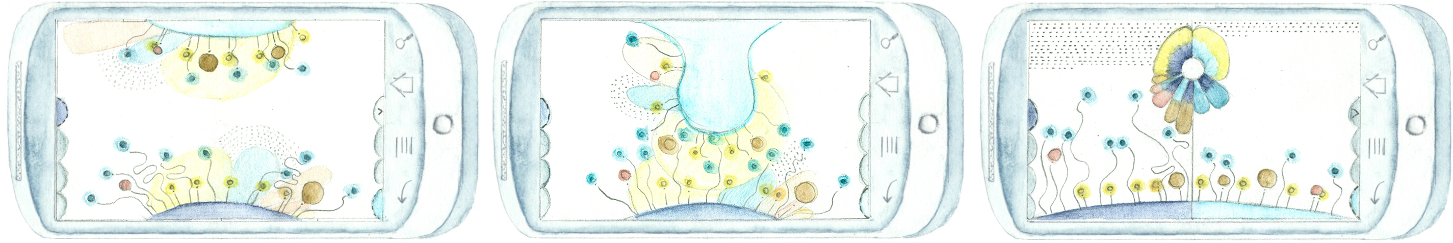
Organic Flowers shows an abstract artwork of one’s behavior: each unit of time (depending on the zoom-level months, days or single activities) becomes a flower. The amount of produced carbon dioxide is reflected in the size of the bloom, while the length of the stem depicts the number of steps taken. Dragging and dropping one timeframe into another (middle) switches to a direct comparison (right).

Another design, Jelly Fish (upper left), shows days as jelly fish whose elevation and size encodes CO2 production. Activities on a day become the jelly fish’s tentacles with colour-coding for type and length for duration. To make comparisons easier, all tentacles of one jelly fish can also be laid out vertically (lower left), forming a more traditional bar chart.
Finally, Footprints (right) is the most verbatim of our charts. It shows all activities of one day in a grid with hours as rows and columns as 6 minute segments. Icons show the type of activity (feet = walking, rails = going by train, etc.) and their colour depicts the carbon dioxide impact.
You can find more details about these designs in our paper.
Moving on
In designing personal informatics applications, coming up with as many ideas as possible usually leads to the best results. Creating the ECO|Balance designs taught us that two things are important: First, having an actual, real-world data set, so the impact of the produced visualizations does not hinge on one’s own preconception of the data. And second, to lower the threshold for creating designs, using low-overhead analog tools such as pencils and creating predefined animations in Powerpoint is preferable to digital drawing tools and implementing visualization algorithms. Regarding motivation strategy, supporting instead of scolding and providing value in itself instead of being a reminder for one’s bad conscience should make for a kinder and more efficient interaction. We plan to implement our most promising designs and make them available as tools to make reducing one’s carbon footprint easier and more enjoyable.


