Numbers From Around the Web: Round 7
Ernesto Ramirez
May 10, 2012
Where are you? A pretty easy question to answer. But, what about, “Where was I?” Not so easy to answer, especially when we start talking about periods of time more than a few days or weeks. Sure, we all have GPS running on our phones now. We can check in with Foursquare/Facebook/Path etc. to keep a log of locations, but that data is fragmented and only represents certain specific locations. What about paths? What would we learn if we knew more about how we traveled about our world?
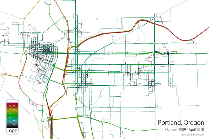
Aaron Parecki is one of the founders of Geoloqi, a location-based services platform. He has also been tracking his location every 6 seconds for the last four years and he has created some amazing visualizations to better understand his movement:
 You may think this is just a boring old map with some travel data layered on top, but what makes this map special is that there is no underlying geospatial data. The lines you see above are Aaron’s actual travel paths from his GPS data. Using this information you can easily see the well traveled roadways by finding the thicker lines. You can even quickly pick out freeways and interstates due to their high speed.
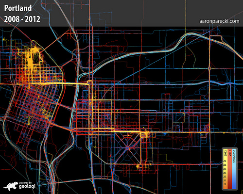
 Here you see Aaron’s data for the last four years (again, there are only the GPS traces). You can see he’s color-coded the data ro represent different years in order to see where he spends his time.
Aaron has a lot more visualizations of his GPS traces, but I’ll leave you with this neat video showing a timelapse of his minute-by-minute movement:
Every few weeks be on the lookout for new posts profiling interesting individuals and their data. If you have an interesting story or link to share leave a comment or contact the author here.


