Personal Data Visualization Contest
Gary Wolf
September 10, 2008
 Yesterday was a red letter day in the world of self-quantification, as Nathan Yau declared the winner in his summer-long personal data visualization context.
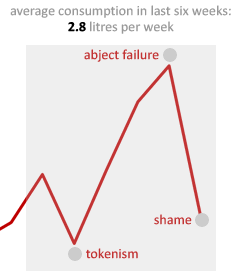
The winner is Tim Graham, whose data blog is an entertaining record of personal data that shows how much narrative (courage, hope, risk, disappointment) can be packed into a single graph. (Fortunately, the “coke” at issue in this tragic tale of a failed quit attempt is Coca-Cola, not cocaine.)
Tim tips his hat to the inspiration of Nicholas Felton of Megafone whose amazing annual report about himself is a great artifact from the future being produced right now.
Nathan’s blog Flowing Data is wonderful, and in yesterday’s post he linked to lots of the entries in his context, all of which are entertaining and some of which contain good ideas for aspiring self-quantifiers. Thanks, Nathan!

