The QS Gallery: Personal Data, Personal Meaning
Ernesto Ramirez
October 31, 2013

On October 10th and 11th we held our fifth Quantified Self conference. These conferences have become a wonderful part of our ongoing work to share how people get personal meaning from their personal data. QS Show&Tells are the cornerstone of the program. In these short talks, we get to hear what you did, how you did it, and what you learned.
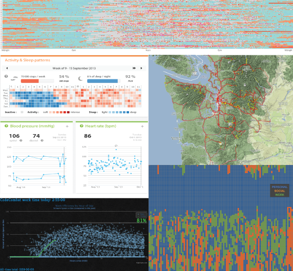
Visualizations of personal data are often important in a QS Show&Tell, so this year we made a simple request of all our conference attendees: send us your favorite personal data visualization and tell us what it means to you. Within a few hours we started receiving amazing images. We posted them at the conference and created some great conversation around making meaning through visualization. But a conference only lasts a few days, so we decided to start publishing them here, along with the same request to you. If you’ve learned something that you are willing to share from seeing your own data in a chart or a graph, please send it along.
Be on the lookout as we begin this journey of sharing our personal meaning making through visualization. The images below are just a preview. Over the coming days, we’ll be putting each of the over 50 QS visualizations into its own post, along with a description and some links.

Thank you to everybody who came to the conference this year and shared their amazing work. See you Amsterdam in May!


