QS Gallery: Mette Dyhrberg
Ernesto Ramirez
November 4, 2013
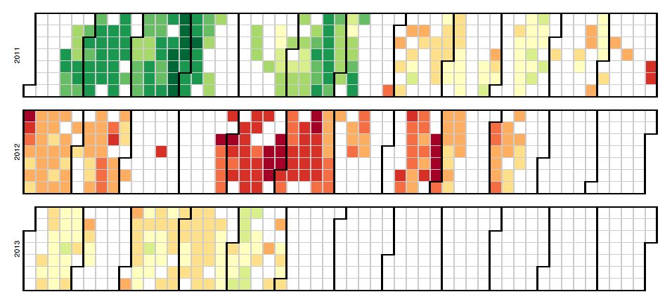
This great QS visualization comes to us from Mette Dyhrberg, a member of our QS New York community.

I gained a lot of insights from this heat map. The most obvious weight gain was no surprise — that’s when I periodically don’t track. In any case, the big picture patterns are easily identified with a heat map.
Realized looking at this heat map that the point of no return was mid-April 2012 — my data shows that was when I switched protein shakes with an egg based breakfast. I have since experimented and seen that protein shake in the morning seems to keep my blood sugar more stable and as a result my weight under control!
Tools: D3 Calendar View visualization, Withings Wireless Scale.
We invite you to take part in this project as we share our favorite personal data visualizations.If you’ve learned something that you are willing to share from seeing your own data in a chart or a graph, please send it along.


