What We Are Reading
Ernesto Ramirez
October 11, 2014
A long one this time. Enjoy the words, numbers, and images herein.
Articles
New biometric tests invade the NBA by Pablo S. Torre and Tom Haberstroh. Data and statistics are nothing new in professional sports. They’ve even made Academy Award nominated movies based the idea that data can help a team win. Until now data on players and teams has come from analysis of practices and gameplay. This great piece opens another discussion about collecting even more personal data about how players in the NBA live their lives off the court. Recall that athletes, coaches, and owners have been talking about out of game data tracking since 2012.
Misleading With Statistics by Eric Portelance. We’ve featured these type of articles before, but the example used here by Eric is not to be missed. So many times the data visualization trumps the actual data when a designer makes editorial choices. After reading this piece you’ll think critically the next time you see a simple line chart.
Handy Tools & Apps by Ray Maker. A great resource for athletes and exercisers who use a variety of tools to capture, export, and work with the activity and workout data we’re collecting.
You are not your browser history by Jer Thorpe. If someone you didn’t know was given a record of every ad served to you in your browser, what would they say about you? Who would they think you were? Jer Thorpe actually put these questions to the test as part of his work with the Floodwatch project. Floodwatch is a very interesting tool (browser extension) that saves and visualizes the adds you see while you browse. They also have a clear privacy policy including giving you access to your data.
Show&Tell
Happiness Logging: One Year In by Jeff Kaufman. A great post here about what Jeff has learned about himself, what is means to log something like “happiness”, and the power of tagging data. After looking at his data, and a commenter’s from the r/quantifiedself subreddit, I’m wondering about the validity of 10-point scales for this type of self-tracking.
Redshit/f.lux Sleep Experiment by Gwern. Our esteemed friend and amazing experimenter is back with another analysis of his sleep data. This time he explains his findings from using a program that shifts the color temperature on his computer away from blue and towards red.
I ran a randomized experiment with a free program (Redshift) which reddens screens at night to avoid tampering with melatonin secretion and sleep from 2012-2013, measuring sleep changes with my Zeo. With 533 days of data, the main result is that Redshift causes me to go to sleep half an hour earlier but otherwise does not improve sleep quality.
Make sure to join the discussion on the forum!
Visualizations

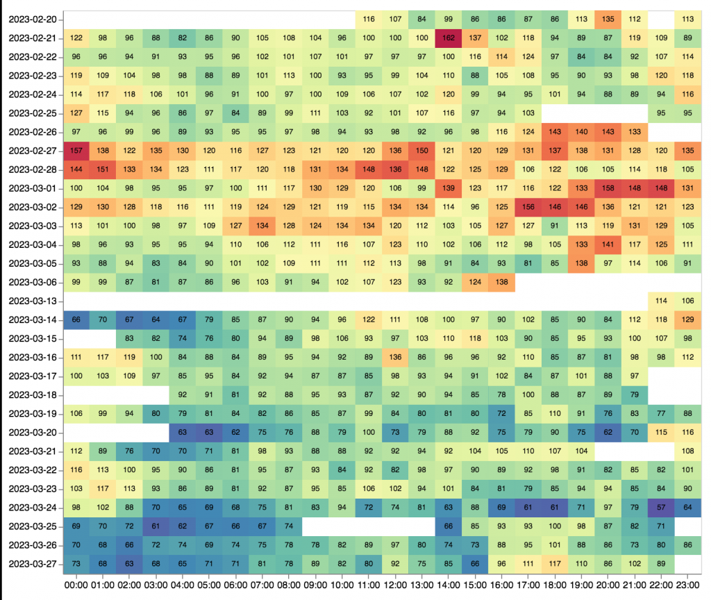
3 Years of computing by Joost Plattel. Our good friend and Amsterdam QS co-organizer, Joost Plattel takes a look at three years of running Lifeslice.

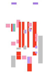
Schedule Abstracted by Mike McDearmon.
Even a hectic schedule can have a sense of serenity with all text, labels, and interface elements removed.

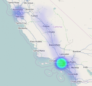
Location History Visualizer by Theo Platt. The data above is actually my full Location History from Google Takeout. Theo made this simple and fast mapping visualization tool. Try is out yourself!
Lifelogging Lab. No visualizations here, but if you’re a designer, visualizer, or just have some neat data then you should submit it to this sure to amazing curated exhibition.
From the Forum
The ethics of QS
Call For Papers: HCI International 2015 Los Angeles
Pebble for Fitness Tracking
QS Business Models
QS, Light, Sleep, Reaction Timing, and the Quantified Us
Are you using your data to write a reference book or tell a story?


