Thinking About Side Effects of Personal Informatics Systems
Ian Li
April 24, 2012
 Victoria Schwanda Sosik is a PhD student in Information Science at Cornell University. She designs and evaluates technologies that support people towards goals of mental and physical wellbeing. She works with Dan Cosley in the Reimagination Lab.
Personal Informatics systems often deal in domains and utilize data that are just that: personal. These systems use data that we create through our daily activities (such as going for a run with Nike+) and help us review it in a way that encourages reflection and self-knowledge. While systems often have unintended uses and consequences, it is especially important that designers of Personal Informatics systems think about how their systems may be used and impact users, because they are dealing in domains that are closely tied to individuals’ ideas of self (such as weight and body image). We’ve encountered examples of these side effects in our studies of people’s experiences using Personal Informatics systems in health and fitness, interpersonal relationships, and reminiscing.
Overly Negative Feedback Can Discourage Use (and Users)
Tools designed to encourage weight loss and physical activity like Nike+, FitBit, SparkPeople and Wii Fit strive to help users reach their goals by tracking data such as calories consumed, amount of exercise and/or current weight. One way these tools motivate users is by having them set goals in the system and then displaying the collected data back to the user as positive or negative progress towards their goal. This strategy follows from theory that shows motivation is sustained by people setting small, achievable goals, identifying the difference between their current state and their goal state, and then exerting effort to achieve the goal.
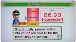
Presenting these data without considering users’ mental states and potential reactions to the data can be harmful, however. One example can be seen in Wii Fit’s Body Test. As part of creating their Wii Fit profile and their system avatar—or Mii—users must complete a Body Test that weighs them, tests their balance and asks them to set a goal. If the user is overweight, they see an animation where their Mii’s girth increases and looks down at its midsection with disbelief, accompanied by an ominous sound effect. The system then displays how far away from a normal BMI the user is. My own first experience with Wii Fit was right after I received it as a Christmas gift. I was at my future in-laws’ house and in front of the whole family when I stepped on the Wii Fit balance board. This was right after my freshman year in college (freshman 15 anyone?) and I wasn’t quite prepared to have my BMI prominently displayed on the 52” screen—needless to say, it wasn’t the most positive first experience with a tool that was supposed to encourage me to be more active.
 |
 |
In principle, according to theories of motivation this should be valuable and useful feedback that helps people know what they need to do. In practice, however, I was not the only one with such a reaction to the Body Test. Participants in two studies on experiences with Wii Fit rarely returned to track their progress using the Body Test because they often found this display “harsh” and thought “it’s one thing to see your [weight], it’s another thing to see yourself–your –as a Stay-Puft Marshmallow man.” If Wii Fit used a more constructive and less degrading visualization, perhaps users would have found the feature motivating and would not have abandoned it after a few weeks as most of our users did in.
Displaying Certain Types of Data Can Create Tunnel Vision
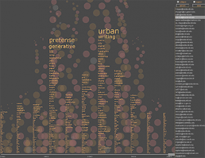
Another potential use of Personal Informatics tools is to help people gain broader self-knowledge about areas of their lives such as their interpersonal relationships. Communication tools like text messaging, email, and Facebook capture interactions that are important to the expression and development of relationships and can be used after the fact to help people make sense of these relationships through visualizations such as Themail shown below (right).
 |
 |
Perhaps the most commonly used tool that aggregates and displays communication data from a relationship is Facebook’s See Friendship page (shown above, left). See Friendship gathers wall posts and comments, photos, mutual events, liked topics, and friends in common between two Facebook users. While this visualization includes several types of data about a friendship, when we asked people to spend some time reflecting about a friendship using the See Friendship page, we found that the data limited what participants reflected on. Participants often started with the most recent content since See Friendship displays data in reverse chronological order, and didn’t always go far enough back to view content from early on in their friendship. Pictures also tended to receive more attention than text. These pictures reminded people of events and activities that were shared but rarely encouraged reflection on deeper, more personal, and longer-term aspects of a friendship such as its evolution. The overall positive communication that happens on Facebook and the lack of capture of mundane, daily communication further biased reflection towards positive and novel events in a friendship.
Designing Personal Informatics Systems With an Eye Towards Side Effects
Our work suggests that health interventions, and other kinds of Personal Informatics systems, are likely to frequently lead to unintended side effects that occasionally might be harmful to either system use or to the users themselves. We suggest that designers think much more carefully about the potential impacts these systems might have on people’s lives and of the practical and ethical responsibilities that accompany the design of systems that help people know and change themselves.


