Visualizing Our Quantified Self
Ernesto Ramirez
September 16, 2014
At our 2013 Quantified Self Global Conference we were excited to share a variety of beautiful and insightful data visualizations from our community. In the months leading up to the conference we asked attendees to send in their own personal data visualizations along with a short description. In our 6 years of hosting Quantified Self meetups and events, as well as running this website, our forum, and social channels, we’ve seen the power of data visualization as a story telling medium. We exist in part to help people tell their stories – about the data they collect, the changes they create, and the insights and new knowledge they’re excited to share.
Today we’re sharing a few of our favorite visualizations from past conferences. The images and descriptions below represent a wide a variety of tracking experiences and techniques, and we hope to showcase eve more unique personal data projects at our upcoming QS15 Conference & Exposition.
Tracking Sleep by Anita Lillie
This is concatenation of screenshots from my sleep app. Most sleep apps don’t let you zoom out like this and still see daily/nightly detail, so I just made it myself. I like that it shows how almost-consistent I am with my sleep, and made me ask new questions about the “shape” of a night of sleep for me.

2.5 Years of My Weight by Mette Dyhrberg
I gained a lot of insights from this heat map. The most obvious weight gain was no surprise — that’s when I periodically don’t track. In any case, the big picture patterns are easily identified with a heat map. Realized looking at this heat map that the point of no return was mid-April 2012 — my data shows that was when I switched protein shakes with an egg based breakfast. I have since experimented and seen that protein shake in the morning seems to keep my blood sugar more stable and as a result my weight under control!

One Month of Blood Sugar by Doug Kanter
This is a visualization of one month of my blood sugar readings from October 2012. I see that my control was generally good, with high blood sugars happening most often around midnight (at the top of the circle).

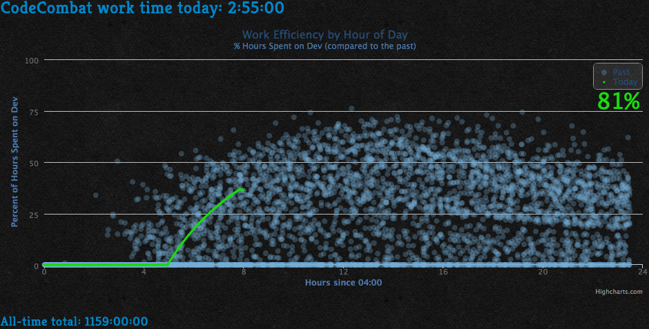
Tracking Productivity by Nick Winter
My percentile feedback graph of my development productivity helps my motivation.
Six Months of My Life by David El Achkar
This is my life during the past six months. Each square = 15 minutes. Each column = 1 day. This picture represents 138 days or 3,000+ activities.

My Thesis Self Portrait by Sara M. Watson
Here’s a period of a few days of webcam images taken using Stan James’ LifeSlice during the final days of editing my thesis on Quantified Self uses of personal data. Serious business!

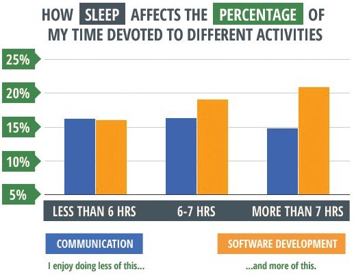
Sleep and Meaningful Work by Robby Macdonell
In an average work day, I don’t consider communication (email, instant message, etc) to be terribly meaningful work. I’d much rather be working on building software. Getting more sleep the night before increases the amount of meaningful work I’m likely to do in a day.
70 Days of Pulse by Laurie Frick
Pulse rate over 24 hours for 70 days from my Basis watch. Grey=null, blues=85


