QS 101: Make It Visual
Ernesto Ramirez
March 8, 2012
So here we are with post #4 in the QS 101 series. We’ve already talked about keeping it simple, using the SMART system, and using social support to help you in your self-tracking process. Today we’re going to talk about what to do once you’ve collected your data – make it visual.
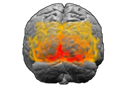
You see, we humans are primarily visual animals. A large portion of our brains are dedicated to processing and deciphering the world we see. It makes intuitive sense that when it comes to self-tracking that we spend time creating images, charts, graphs, and visualizations that represent our collected data. One of the great things about our brains, especially our visual cortex, is that it is very, very good at recognizing patterns. Pattern recognition is a key aspect of the self-tracking practice. Being able to identify and recognize patterns related to behavior, thoughts, location, etc. helps us to start to tease out the intricate patterns that make up the complex cause and effect game we call life.
But Aren’t Numbers Enough?
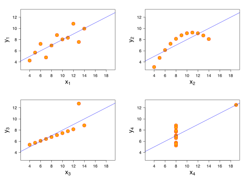
Glad you asked! While we all love the numbers we generate from our different self-tracking methods, being able to see a visual representation of the data allows us to look deeper into the intricacies of the numerical values. Consider for a moment the wonderful example provided by English statistician, Francis Anscombe. Let’s consider the following four graphs:
 You can immediately see the difference among the four graphs, they obviously represent very different characteristics of a measured phenomena. What’s interesting here, and what Anscombe’s Quartet demonstrates, is that simple statistics can be woefully inadequate for understanding datasets. Funny thing about each of those graphs – the data displayed has the same summary characteristics across each graph. That is, each graph has the same mean, variance, correlation and regression line. Only when the data is plotted can differences among the data be observed.
What Now?
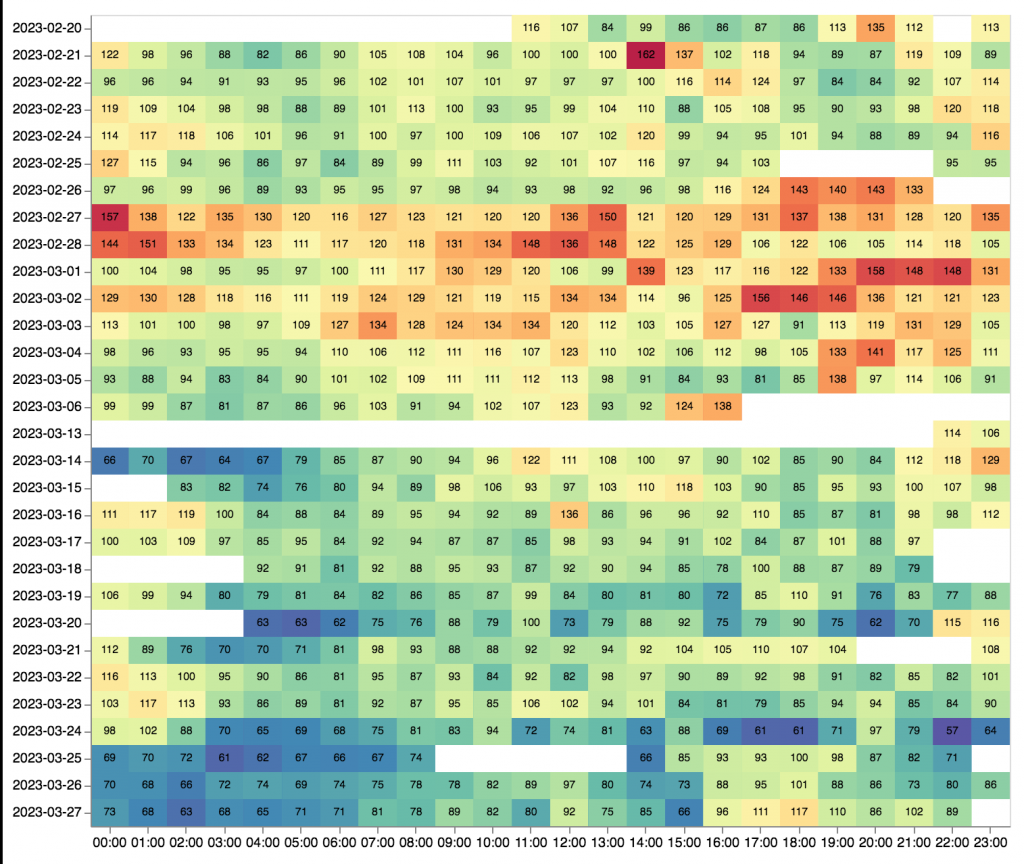
There are a variety of tools and services out there to help you visualize your data, generate patterns and bring insight to your data – and we’ve highlighted them many times before here on the QS Blog. Hopefully looking back through these previous posts will help you and inspire you to spend some time making your data visual!
- Personal Data Visualization – great links to numerous tools!
- Jaw-Dropping Infographics for Beginners
- A Tour Through the Visualization Zoo
- Visual Inspiration
Do you have a favorite visualization or data viz tool? Share it in the comments below!


