Jaw-Dropping Infographics for Beginners
Alexandra Carmichael
May 10, 2010
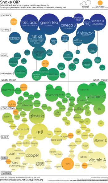 Now that’s just beautiful. David McCandless and Andy Perkins put together this infographic to show the level of scientific evidence for different health supplements. I’m inspired by what is possible in visualizing data, but I don’t know where to start.
So here’s my question for the Quantified Self Advisory Board. What are the easiest tools out there for complete beginners to generate jaw-dropping infographics?
I asked Jeff Heer of Stanford and Nathan Yau of FlowingData to list their top 5 answers. It’s part of our series of occasional requests to QS advisors for help with individual projects. Here’s what Jeff and Nathan had to say.
———-
Nathan Yau’s answer:
 Hmm, jaw-dropping infographics for complete beginners… that’s a
tough one. i don’t think that’s possible, to be honest. it takes a lot
of time and practice.
Tools to visualize your data, however, well, that’s a different story. For the plug-and-go,
there’s Many Eyes, tableau, instantatlas, spatialkey, or even this free
tool that is online interface with R as the backend: http://www.yeroon.
The available toolset explodes though if you’re willing to do some
programming: R, jeff’s flare and prefuse packages, Processing, Flash,
and even stuff with javascript and SVG…
Personally, I mostly use flash/actionscript for interactives and R and Illustrator for static graphics.
My name is Nathan Yau, and I’m the one writing for FlowingData. In a
previous life I was an electrical engineering and computer science
student at Berkeley, but now I’m a UCLA PhD candidate in
statistics with a focus in data visualization.
More specifically, I’m most interested in
- Social data visualization
- Self-surveillance
- Data for non-professionals
In a nutshell, I want to make data available and useful to those who
aren’t necessarily data experts; I think visualization plays a major
role in this.
———-
Jeff Heer’s answer:

Nathan’s list largely coincides with mine. I’d add Protovis, our
JavaScript visualization tools–we have a new release with an extensive
list of new capabilities just about to launch: http://protovis.org.
also found Tableau to be particularly useful for exploratory data
analysis and visualization prototyping — and their new Tableau Public
offering is free, which is great so long one is comfortable sharing
their data and visuals with the world (a la Many Eyes).
Jeff Heer is an Assistant Professor of Computer
Science at Stanford University, where he works on human-computer
interaction, visualization, and social computing. His research
investigates the perceptual, cognitive, and social factors involved in
making sense of large data collections, resulting in new interactive
systems for visual analysis and communication. His website is http://hci.stanford.edu/jheer/
———-
Thanks so much to Jeff and Nathan for their
answers! Brilliant and experimenting QS readers, please send in your questions too and
we’ll do our best to find answers for you.

