Numbers From Around the Web: Round 6
Ernesto Ramirez
April 26, 2012
There is something really magical about taking data and turning it into a compelling visual image. Even though I’ve already written a bit about the importance of making data visual, I am consistently amazed at how data can be made more appealing and informative by creating eye-popping graphics. Today we are devoting this NFATW post to some amazing projects with beautiful data.
Tom MacWright is an engineer for MapBox and Development Seed and spends his time creating and using amazing visual representations of his data. Here are just two of many wonderful projects.
A New Running Map
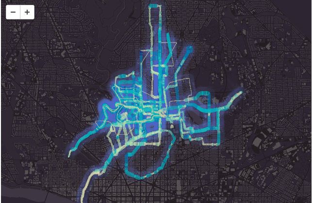
Tom wasn’t happy with the data visualization he was getting from his Garmin GPS and heart rate watch so he decided to build his own using tools he works with every day. What came out was a really interesting interactive website that visualizes his running routes along with his heart rate. Click on the image above to play around with him data.
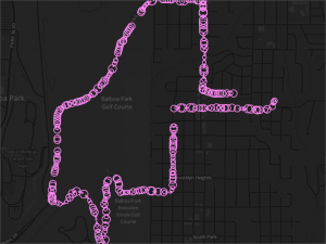
He’s also created a unique representation of the same time of running data (GPS + HR) that anyone can play with called Ventricle. Ventricle allows you to plot your own running data if you have .gpx files.
Minute
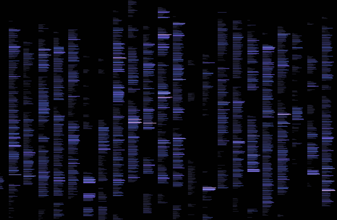
I’ve had a long standing interest in how I spend my time interacting with my computer. As a long time RescueTime user I’ve gotten used to having something watching my computer use and informing me about my habits. Tom was also interested in his computer use, but wanted something that had less functionality while still giving him information that was important. So, he developed Minute, a keystroke counter and visualization system that constantly records and displays the keystroke frequency over time.
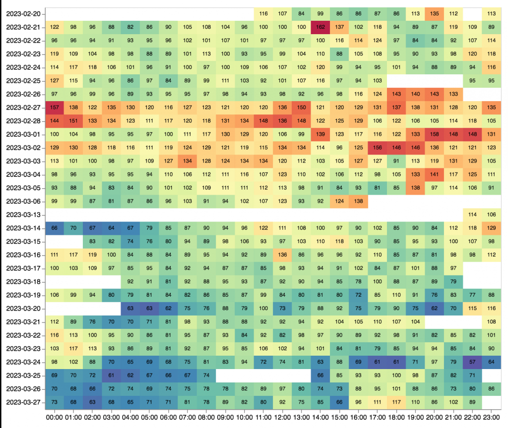
By using a heat map he is able to better understand the pattern of his technology usage. Interestingly, he is also able to make inferences about his sleep and leisure time as he treats them as the inverse of his keystroke time:
Minute is an open-source application hosted on github so if you’re interested in understanding your own computer use or want to contribute to the project go take a look at the source code.
We’ll wrap up today with a quote from Tom’s post on what he learned from developing and using Minute:
Tracking nearly anything you do is alarming and humbling. The aggregates of our actions are lost on us: we can watch hundreds of hours of television and write it off as a small time commitment. How much is too much? It’s hard to make pretty charts without learning something and thinking about what they should look like.
Every few weeks be on the lookout for new posts profiling interesting individuals and their data. If you have an interesting story or link to share leave a comment or contact the author here.


