Visualization Inspiration
Alexandra Carmichael
September 6, 2009
For us self-trackers, data can pile up faster than we know what to do with it. Deriving meaning from the numbers we collect is a challenge I hear over and over at every Quantified Self gathering.
Here’s a secret: visualizing your data is a powerful tool for discovering the treasured meaning you seek. The classic work in this field is arguably Edward Tufte’s The Visual Display of Quantitative Information.
But there is a new crop of tech-savvy visualizers getting in on the game. Here are four I’ve come across recently, to inspire and inform your own exploration.
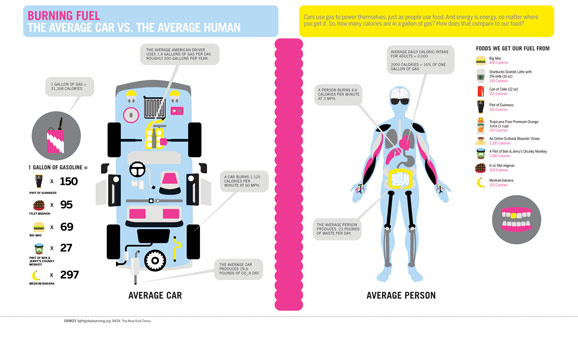
1. The fine folks at Good Magazine. A beautiful compilation of their recent visualizations was posted by David McCandless on the Information is Beautiful blog. For example, this image compares how the average car and the average human burn fuel.

2. Jeffrey Heer, Assistant Professor of Computer Science at Stanford. Jeff has created
open source interactive visualization toolkits like Flare that are freely available for anyone to use. Have a look at his other awesome projects too.
3. Aaron Koblin. This talented Googler takes crowd or system data and creates amazing images and sounds. Must see: his flight path and Amsterdam SMS visualizations.
4. And a book, just released. Beautiful Data: The Stories Behind Elegant Data Solutions. Check out Chapter 1: Seeing Your Life in Data by Nathan Yau of the Flowing Data blog.
If you have any additions to this list or amazing visualizations of your own to share, please feel free to post them in the comments. Happy visualizing!!


