What We Are Reading
Steven Jonas
September 14, 2017

Articles
Smelling Food Makes You Fat by Robert Sanders. The late Seth Roberts, an influential contributor to the QS community and prodigious self-experimenter, wrote a book called the Shangri-La Diet based on radical weight regulation ideas stemming from his observation that his body seemed to treat calories from familiar sources differently. The germ of his theory came from a trip to Paris, where Seth found that he lost his appetite, and subsequently a good deal of weight, while trying a variety of sodas that, for him, had novel flavors. This seemed odd, given the calorie content. With further testing of his hypothesis, he theorized that the brain associates flavors with calories and will store calories from familiar flavors and burn calories from unfamiliar flavor sources (you can get his book or read this paper to get a full explanation of the theory and why the body would function this way). Related, he found that consuming flavorless calories in the form of extra light olive oil caused him to lose weight. This was a completely new model of weight regulation that, frankly, most people didn’t know what to do with. But this recent study from UC Berkeley seems to validate aspects of Seth’s theory. Scientists found that they were able to help obese mice lose weight by knocking out their sense of smell. Mice who still had their sense of smell ate the same food and increased in size to twice their starting weight. It’s an incredible example of the ability of self-experiments to create novel insights through accurate and tenacious observation. -Steven
“Mysteries in Reference Lists by Martin Fenner. Since we spend quite a bit of time trying to figure out how to get things right in recording measurements, communicating what we’ve done, and helping others do the same, we’ve come to enjoy a deep respect for how difficult it is create an accurate, explicit recitation of the steps involved in any action. There’s just so much ambiguity in what we say — and also so much tacit knowledge in what we do. But some things are much simpler than others: for instance, academic citations. There are only a few possible elements: Title, Author(s), Date, Journal Name, Volume, Issue, Page(s), DOI, URL, plus some specialty reference elements available to ultra-professionals when needed. You’d think that almost nothing could go wrong. That’s why I enjoyed this post by Martin Fenner so much: Even in the simple case of citations created by scholarly professionals, mysteries are common. -Gary
Evidence Based or Person Centered? An Ontological Debate by Rani Lill Anjum. This is a descriptive account of philosophical differences between two common ways of thinking about how we get sick and what we can do to improve our health. But for me Anjum described a deep underlying antagonism between two different philosophies of care, which helps me understand terrain I’m on when struggling with scientific and medical criticism of Quantified Self practices. I’m going to see how it works to address these criticisms not only as pragmatic doubts about QS methods but also as strong – if implicit – philosophical freak-outs. -Gary
Self-Tracking Induced Sleep Anxiety by Kelly Glazer Baron, et al. This one is presented without comment, but there’s a QS Forum topic started here: “Orthosomnia”. -Gary
Show&Tell
My Scars by Ellis Bartholomeus. Ellis has taken a quantitative and thoughtful look at the form and meaning of the physical scars she has accumulated. She walks through a map of decades’ worth of scars and how she turned it into data, finding that when she added the lengths of her scars, the total is over a meter. -Azure
Max’s Vocabulary Acquisition by Nick Winter. Nick tracked the first 100 to 1000 English and Chinese words that his son learned through the first two years of his life. Comparing his son’s acquisition rate to other prominent examples, he found that his son’s progress appears to be rather linear. Nick also made Max’s Vocabulary data to look at yourself. -Steven
Fight For Your Right to Recess by Cantor Soule-Reeves. At Cantor’s school, recess is cancelled whenever it rains, an issue since he lives in Portland, Oregon. He wanted to make a case to the administrators that this policy is negatively affecting his activity levels by tracking his steps and comparing days with and without recess. -Azure
What I Learned from Weighing Myself 15 Times in a Day by Beth Skwarecki. If you are tracking your weight, a common and prudent piece of advice is to weigh yourself the same time every day. Since our weight fluctuates throughout the day, by taking a measurement at the same time, you reduce the amount of randomness in the result. However, what is not often explored is how much weight actually fluctuates during a day. In this example, the swing was over 8 pounds. -Steven (thanks to Richard Sprague)
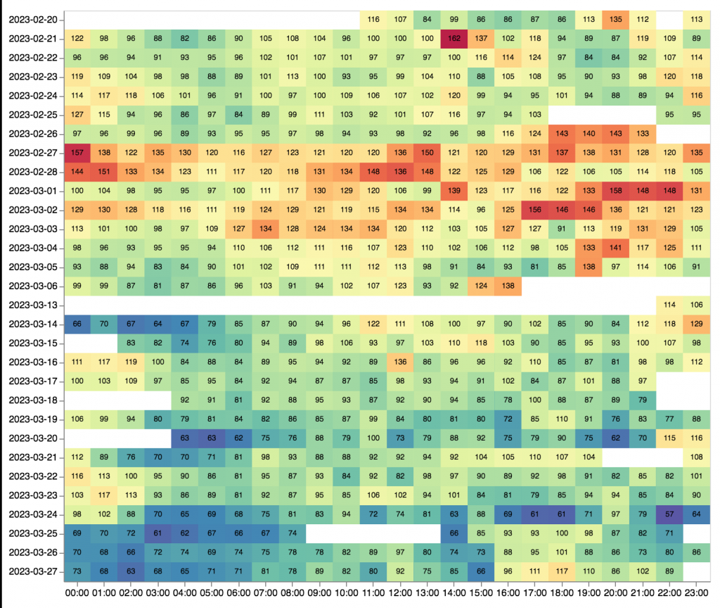
Tracking Sleep and Resting Heart Rate by Jakob Eg Larsen. Jakob has tracked his sleep and resting heart rate (RHR) for the past four years. By tracking his RHR over a long period of time, has allowed Jakob to develop an intuition for connections between his RHR and physiological state. He has seen multiple times, for instance, that his resting heart rate will increase because of a coming flu before the onset of any other symptoms. -Azure
Data Visualizations
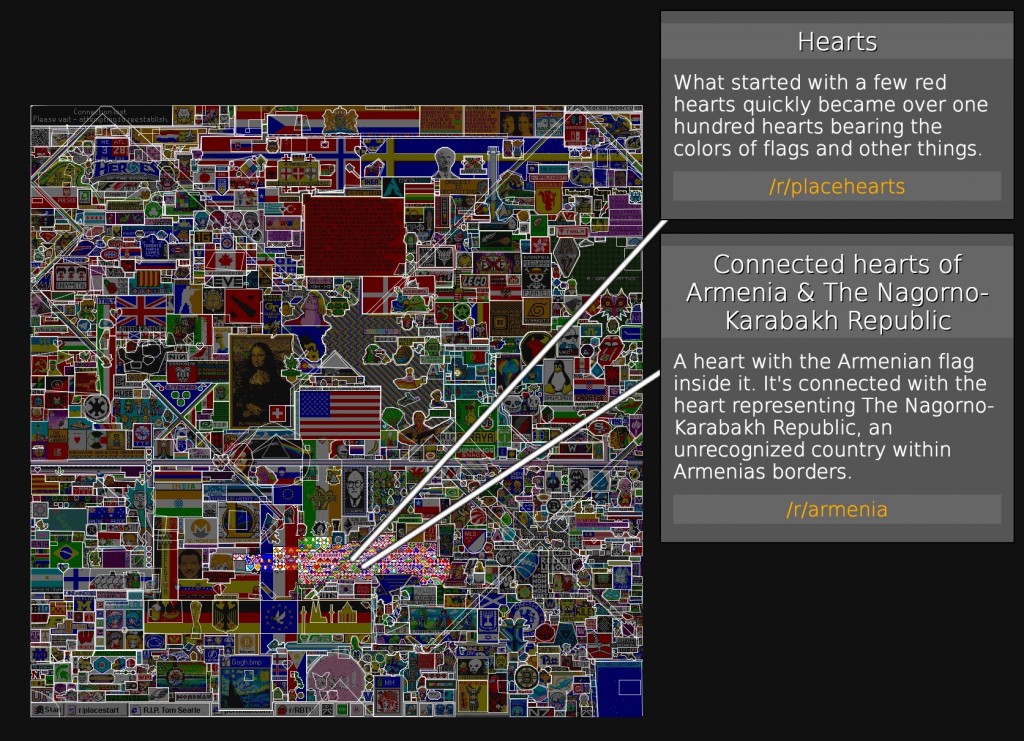
r/place Atlas by Rolan Rytz. On April Fool’s Day this year, Reddit tried an incredible community art experiment called r/place where every user is allowed to change only a single pixel every five minutes on a digital 1000×1000 canvas. The resulting 72 hour timelapse is an entrancing drama as various subreddits fought for space to have their imagery placed on the canvas. The reason I’m mentioning it now is that I recently came across an attempt to tell the story of this project by annotating all the images that showed up at r/place: what subreddit was behind the image, was there a conflict over that space, what new imagery arose from it, and what compromises were made between two warring factions (the r/France-r/Germany compromise was excellent). The atlas contains nearly 1500 entries. -Steven
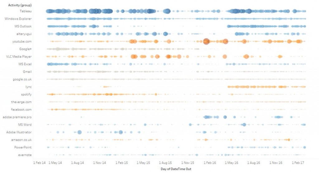
#tabtQS 1: RescueTime in Tableau by Tim Ngwena. This novel visualization shows app usage over a three year period. For Tim, I’m sure that there are all sorts of stories embedded in the increased or decreased usage of certain applications during certain time periods. In the link, Tim walks through the workflow for creating this chart. -Steven
 Activity Levels Around the World. This visualization is from a paper exploring “activity inequality” and comes 717,527 individuals’ smartphone data with over 68 million days of activity. -Steven (thanks to Richard Sprague)
You can subscribe to What We’re Reading and get them straight to your inbox.


